Traffic heatmap
Let's build some more advanced data visualization, that is users' engagement heatmap. The darker color means the higher user engagement (avgSessionDuration) in this time of the day. This example was inspired by Todd Moy.
# traffic heatmap
# based on https://github.com/toddmoy/Google-Analytics-Heatmap/blob/master/traffic_heatmap.R

# install libraries
# install.packages("googleAuthR")
# install.packages("googleAnalyticsR")
# install.packages("ggplot2")
# install.packages("RColorBrewer")

# load libraries
library("googleAuthR")
library("googleAnalyticsR")
library("ggplot2")
library("RColorBrewer")

# authorize the connection with Google Analytics servers
ga_auth()

## pick a profile with data to query
#ga_id <- account_list[275,'viewId']

# or give it explicite using tool http://michalbrys.github.io/ga-tools/table-id.html in format 99999999
ga_id <- 00000000

gadata <- google_analytics(id = ga_id,
                           start="2012-01-01", end="2016-06-30",
                           metrics = c("avgSessionDuration"),
                           dimensions = c("dayOfWeekName", "hour"),
                           max = 5000)


# order the data
gadata$dayOfWeekName <- factor(gadata$dayOfWeekName, levels = c("Sunday",
                                                          "Monday",
                                                          "Tuesday",
                                                          "Wednesday",
                                                          "Thursday",
                                                          "Friday",
                                                          "Saturday"))
gadata[order(gadata$dayOfWeekName),]

# convert the data frame to xtab
heatmap_data <- xtabs(avgSessionDuration ~ dayOfWeekName + hour, data=gadata)
When data is transformed to the desired outcome, it's time to prepare the plot:
# plot heatmap
heatmap(heatmap_data,
        col=colorRampPalette(brewer.pal(9,"Blues"))(100),
        revC=TRUE,
        scale="none",
        Rowv=NA, Colv=NA,
        main="avgSessionDuration by Day and Hour",
        xlab="Hour")
And the result is:
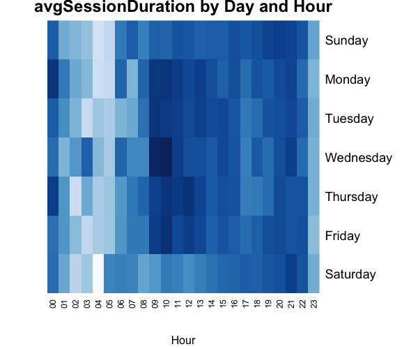
In this case - Wednesday morning is the most engaging time of the day for users :)
Source code
The complete source code of the examples showed above is in my GitHub repository:
github.com/michalbrys/R-Google-Analytics/blob/master/6_heatmap.R